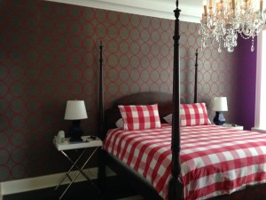
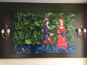
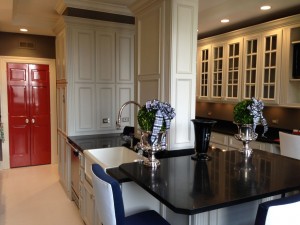
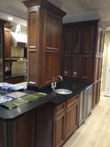
Painting in Partnership encouraged us to stretch with some bold choices. We trusted their experience and now have a 'masterpiece'.
- Lori and Don Lyon, Arlington Heights
Phone: (847)934-8885 | Email: info@paintpartner.com Visit PIP's Facebook Page View Mario Guertin's LinkedIn Profile Visit PaintPartner's Google+ Page Follow PaintPartner on Twitter Visit PIP's Pinterest Page Visit PIP's Houzz Page Subscribe to PaintPartner's RSS Feed

High-End Wall Coverings Deserve Special Care in their Installation

Bohemian Bangles Grasscloth Wallpaper by Philip Jeffries

During the past year, for the first time in our history as painting and decorating contractors in the Chicago area, our volume of installations of high-end wall coverings has exceeded our volume of decorative painting projects. These wallpaper installations have included numerous Lincrusta, Philip Jeffries, Elitis, J.R. Burrows papers among others. This trend has been building for two or three years now.

When dealing with such exclusive and expensive materials, an additional strong dose of caution is needed. First, the installation must only be handled by the most experienced of craftsmen. By that, I mean someone with a passion for precision in execution and a broad base of knowledge and experience. Many of these papers present some unique challenges. Therefore the installer must also be able to think on his/her feet in problem solving. Lincrusta is a prime example of these installation challenges. Because of its rigidity, and thickness, it is more akin to a floor covering than a wall covering. Great skill must be applied to the cutting of the material.

Big Croco Wallcovering by Elitis

Second, we take additional installation steps. For instance, we often use a liner paper before installing the wallpaper. We also prime the liner once installed. Skipping that step may ruin the liner (and a wall) if for some reason a sheet needs to be removed after it has begun to set on the liner. High-gloss, solid-color wall coverings (lacquer look) present challenges of their own: every imperfection in the walls with telegraph through the wallpaper, even with the use of a heavy weight liner. Therefore, to ensure a mirror-like appearance, the walls must be skimmed and brought to a level 5 finish, before being primed and installing the liner. These additional steps increase the cost of the project. However, they ensure a successful installation that last a very long time.

High-end wall coverings must be treated with caution and respect. Failure to do so, may result in disaster.

Painting Wood Cabinets – Creating a Bold New Look for a Kitchen

Hand-Painted Cabinets, Hand-Painted Wood Floor and Lacquered Doors

On a recent project on Lake Shore Drive in Chicago, our painting and decorating company was tasked, among other things, to hand-paint the wood cabinets in a large kitchen. In fact, the kitchen had eighty doors and drawer fronts, which included three nine-foot doors for closet areas.

The cabinets were solid cherry and had been subtly distressed with tools by the manufacturer. Additionally, there was a busy tile floor throughout, which was replaced with a wide-plank oak floor. As you can tell from the before and after pictures, our client had a dramatically different look in mind for his kitchen. What he had pictured were hand-painted cabinets, a hand-painted wood floor, dark walls and dark orange lacquered doors for the pantry and laundry room.

Kitchen – Before

Creating a professional hand-painted finish like this involved a total of ten steps and over two hundred fifty hours of labor, executed over a four-week time period. All our cabinet refinishing work was done on the client’s premises, in the empty, large living room adjacent to the kitchen. Because the project was in a condominium building, no spray equipment could be used and all products used were waterborne.

The project included to puttying/sanding of all the hardware holes on the doors and drawers. It also involved the removal of the moldings holding the glass in place on twelve doors and finishing all those moldings and screw heads like the rest of the cabinets. Of course, the project would not have been complete without installing about two hundred new round bumpers on all the doors and drawers!

Hand-painting the floor boards also presented particular challenges. We first had to fill all the gaps between the boards with wood putty. In order to avoid filling the wood grain by puttying the gaps, we had to first tape off the board edges before puttying the gaps. After the putty was dry, we removed the tape and sanded the putty. We coated the boards with three coats of a semi-gloss industrial marine floor coating to achieve the desired durability and sheen.

Our work as a painting and decorating contractor first requires that we deeply listen to our clients in order to grasp their vision. Second, it also requires that we do whatever is necessary to achieve the end-result the client is looking for, by applying our skill, knowledge and experience. Producing that outcome is what we are about as a team.

The Story of “How Paint Ended Up in a Can”

The Story of “How Paint Ended Up in a Can”

This summer, I was asked to write a feature article for the 50Th Anniversary of the Paint & Decorating Retailer magazine. Appropriately, it became an article about the story of how paint ended up in a can! I love history and I love to tell stories in a way that alters and enriches the readers’ perspective. I also took the opportunity to showcase some of the paint memorabilia I have been collecting (“rescuing”) for over twenty years.

Historically, for as long as mankind existed, painters were the “mixers” of the ingredients of paint. The needs of the day dictated how much and what was mixed. The Industrial Revolution and an explosion in the population combined to create a situation where the needs for paint began to outstrip painters’ ability to meet the demand. Painters started begging manufacturers of paint ingredients to start making ready-mixed paints., thereby giving birth toe “paint can”.

As painters lost their foothold in paint-making, the Chemist emerged as the “King of the Hill”. The chemist became the “mixer” in the lab to meet an ever-increasingly sophisticated array of needs for paint. This article is a collection of anecdotes, pictures and artifacts that depict that transition, along with the major technological innovations that made it all possible.

Children Painting a Mural on Virtues – Part 3: The Official Unveiling and the Takeaways

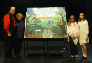
Unveiled Mural on Virtues

Over a two-month period, two children from Science & Arts Academy of Des Plaines worked on creating a unique mural on the theme for their current academic year: Virtues. The team at Painting in Partnership conceived this project and facilitated its creative process.
The official unveiling of the mural took place on October 24th, in front of a gymnasium full of hundreds of students, family and friends. Our two artists, Anna and Juliana, had the honor of narrating the meaning of their creation. They were excited and surely up to the task. Everyone enjoyed their heart-felt presentation.
To complete the experience, we asked them to tell us what they learned from this mural painting experience. Mary Helen, one of the moms, came up with a series of insightful questions for them. Here are some extracts:

How was the mural painting experience different from what you expected? Is there any part of the mural creation process that would apply to the theme for the mural?

In some ways, the mural experience was different that we expected: it was a lot harder. We underestimated the surface as far as the size of the painting. A 4”x5″ canvas can hold a lot of rolling hills!

And the bulldog on the path is like the process of the painting in some way. There maybe be an obstacle, but you have to persevere if you want to get to the happy place. You can’t just give up the first time it gets hard or tedious or whatever. You have to be determined, and to create a good mural you have to stick with it and get through the obstacles and the boring parts so you can get to the fun parts and the things that make the mural really good. And we are proud of what we created, and grateful for the help from Mario and Fran and Rita.

So your mural seems to say that being a good person is a choice. Why would anyone choose not to be on the path to light?

We think the mural says that being a good person is a choice. At least that is one way to take it, but it will be different for everyone. What if the world you lived in was so strict that you thought you were bad by those standards, but you were really good by other standards? People need perspective about what good really is.

Why don’t people just take the path to light? Because it takes work!!! Because they don’t realize it is the path to the light and just assume it is a path to deeper darkness. They see the obstacles and don’t know the other side. If they have never seen the light, how do they know what darkness is? If you don’t feel joy, then you don’t know sadness for what it is.

How do people get stuck in the dark and scary part of the mural?

We think people get stuck sometimes because of their own fear or their laziness. They get bored, or anxious, or they ignore their compass. Maybe they get confused about the compass and which arrow points in the right direction. But to move to a better place, they have to find their compass and look at it and let it guide them. This takes determination. The shadow wolf chasing the white rabbit is desperation chasing hope. Desperation tries to catch and swallow hope, but it is not too late for people to choose the path.

Congratulations to our young artists Anna and Juliana for their thoughtfulness and determination. Job well done! I would be remised not to thank their mothers for their engagement with the process and their overall support. Lastly, I want to acknowledge Science and Arts Academy for creating an environment that nurtures creativity and self-expression. Our team at Painting in Partnership is grateful for having been part and witness to this creation. This project was an opportunity to express the true meaning our company’s name.

Transforming the Appearance of a Vintage Turret with Four “Period” Colors

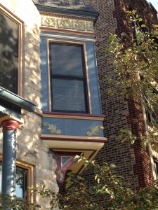
Vintage Turret After Color Makeover

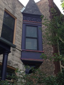
Vintage Turret Before Color Makeover

Our client has a late nineteen-century gray stone building in the Hyde Park neighborhood of Chicago. Last year, she had hired painters to help her do a major color makeover on her turret. As shown in the “before” picture, the bay window was indeed “color-challenged”.

Our client had to let go of her initial painters, as they could not come up with a successful color palette for the project. Frustrated by her first experience, she found out about our company’s historical color expertise and quality of execution. She hired us to bring about a solution to her color design predicament.

Developing the color scheme for the project turned out to be the most challenging part of the project. For half the day, the bay window is in the shade. In the afternoon, it is in the bright sun. Finding colors that looked good in the shade and did not wash out in the sun (or appeared different in bright light) proved to be quite difficult. Arriving at the right colors required a few hours of consultation and actual field-testing the color in different lighting conditions. Achieving the desired result required the concerted efforts of all involved, including the client.

The project also involved extensive preparation of the metal surfaces, as well as some metal fabrication to replace six missing ornamental pieces at the bottom of the panels. Working with the customer until the client is completely satisfied is what we do as a team in our company