Phone: (847)934-8885 | Email: info@paintpartner.com Visit PIP's Facebook Page View Mario Guertin's LinkedIn Profile Visit PaintPartner's Google+ Page Follow PaintPartner on Twitter Visit PIP's Pinterest Page Visit PIP's Houzz Page Subscribe to PaintPartner's RSS Feed

Archive for Historical Paint Colors

Dressing Up a Historic Chicago Row House in Mid-Century Colors

Historic Chicago Row House - After Painting

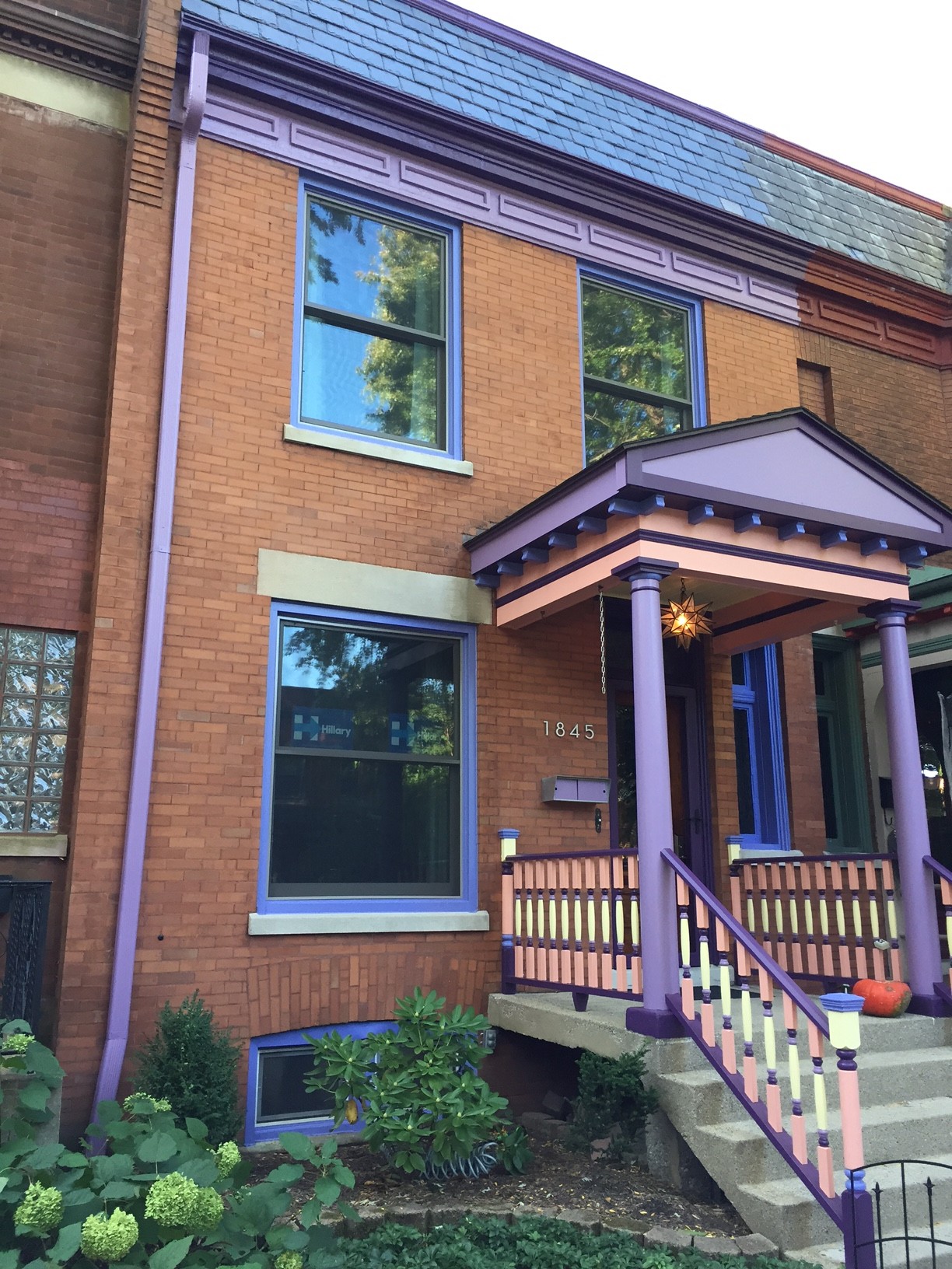
Historic Chicago Row House – After Painting

Historic Chicago Row House - Before

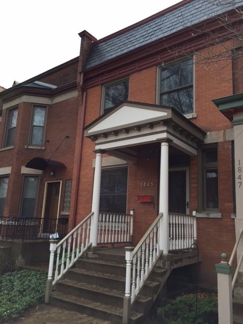
Historic Chicago Row House – Before Painting

Our Painting and decorating company recently put the finishing touches to the façade of an historic row house in Chicago. The façade had a metal cornice and crown, five windows, a front entrance and a porch. As you can see from the Before picture, the façade was very subdued. The client felt that the façade did not do justice to the character of the house nor the beloved Mid-Century style of his interior décor.

With the client’s involvement, we developed a 5-color palette that introduced the Mid-Century style of the interior decorating of the house. The client’s passion for this particular style is rooted in his childhood with his grandparents. When he inherited their furnishings and other belongings, it started him on a quest to recreate those childhood memories in his own house. He did such an outstanding job at it that Houzz recently published a most interesting video on the interior of his house and the story behind its decorating elements. Click on this link to view the video.

By accident, it just so happened that the colors selected for the project happen to closely match colors that can be found in the Pantone color pairings for the 2016 Color of the Year, shown on this link . When we do color consultation, listening to the client is key to insure a successful result, in this case a result that reflects his personality and décor preferences, as well as beautifies the façade of his house.

Transforming the Appearance of a Vintage Turret with Four “Period” Colors

Vintage Turret After Color Makeover

Vintage Turret Before Color Makeover

Our client has a late nineteen-century gray stone building in the Hyde Park neighborhood of Chicago. Last year, she had hired painters to help her do a major color makeover on her turret. As shown in the “before” picture, the bay window was indeed “color-challenged”.

Our client had to let go of her initial painters, as they could not come up with a successful color palette for the project. Frustrated by her first experience, she found out about our company’s historical color expertise and quality of execution. She hired us to bring about a solution to her color design predicament.

Developing the color scheme for the project turned out to be the most challenging part of the project. For half the day, the bay window is in the shade. In the afternoon, it is in the bright sun. Finding colors that looked good in the shade and did not wash out in the sun (or appeared different in bright light) proved to be quite difficult. Arriving at the right colors required a few hours of consultation and actual field-testing the color in different lighting conditions. Achieving the desired result required the concerted efforts of all involved, including the client.

The project also involved extensive preparation of the metal surfaces, as well as some metal fabrication to replace six missing ornamental pieces at the bottom of the panels. Working with the customer until the client is completely satisfied is what we do as a team in our company

A Paint Color Makeover – Before and After

This 1889 vintage Chicago building was in sore need of a historical paint makeover. The consensus among the owners of its ten condos was that the old color scheme did not do justice to the period, the style, nor the masonry materials of the building’s facade. The owners were unanimous in their desire to have a color scheme that flattered the beauty and history of their building.

We met twice with a committee of the owners most interested in being involved in the selection of a new color scheme. The first time we met was a fact-finding mission where we learned about the owners’ color likes and dislikes. We incorporated that feedback in developing a color palette that we felt would produce the desired result. To facilitate the communication with the owners, we prepared a sample board showing a mockup of key sections of the building using the six-color palette we were recommending. During the second color consultation, we went over the sample board with the owners. Based on the feedback we received, we made one change to the color scheme. We now had the green light to proceed!

Three hundred fifty hours of work later, the owners, neighbors and pedestrians in this busy neighborhood are now able to rejoice in the new period colors of this vintage building and have a renewed appreciation for the beauty of its Victorian period details. Here is what one of the owners had to say:
“The paint color palette turned out better then we could have hoped for. You and your wife were able to help our association come to an agreement on a historically accurate plan that incorporated all of our feedback in a matter of two meetings, something that would have taken us months to do on our own. The painted areas now complement and accentuate the beautiful stone and metal features of our building, instead of clashing like a sore thumb. In a neighborhood where many building owners have chosen to paint such metal features a uniform color, to save the effort and cost, our building is now a shining example of what these historic buildings can be. Given the feedback from the neighborhood, I hope our building will be an inspiration for others to make the extra effort to celebrate the unique architectural character and history of our community.”

Below are some before and after pictures of key portions of the building.

Bay Window After Paint Color Restoration

Bay Window Before Paint Restoration

Facade After Paint Color Restoration

Facade Before Paint Color Restoration

Front Unit After Paint Color Restoration

Front Unit Before Paint Color Restoration

Involving the Owners in the Creation of an Exterior Period Color Makeover

When developing a new historical paint color scheme for a building, we believe in involving the clients in the process. As indicated in a recent blog post, we recently went through the development of a new color palette for the façade of this unique 1889 Chicago brick Victorian-era building, now converted to condominiums.

As a first step, we invited the owners to attend a meeting with Rita Guertin, our Color and Concept Consultant. From the outset, it was evident that they all shared a common discontent about the current color scheme. During the meeting, the owners voiced their color likes and dislikes. Some even brought color samples and pictures. We believe that involving the clients early in this way helps to create a successful outcome for everyone.

Historical Paint Color Makeover

Armed with that feedback and input, we began to put together a six-color palette for the building’s façade. One of the flaws of the old color scheme was that it did not take into account the colors of the building’s masonry: gray limestone, strong red face brick and warm/earthy tones for the common brick of the sides of the building. We felt that incorporating these colors into the palette was needed to create harmony, and highlight the beauty and character of the decorative features of the building.

We then organized a second client meeting to review our proposed historical color selection and its placement on the building. In order to easily communicate the concept, we overlaid our color selections onto four color pictures of the building’s main decorative elements. From the feedback we received, we made only one change to the color scheme: the warm buff color was replaced by a taupe gray color, which harmonized well with the mortar color of the common brick, as well as the limestone.

Our next blog post, will describe how you “rig up” to handle a project of this size and nature, in order to meet the many requirements of City ordinances, as well as EPA and OSHA regulations.

Cookbooks Held Recipes for Colonial Interior Paint Colors

Who would have thought that Early-American historical paint colors could be found in that period ‘s cookbooks. In early days, cookbooks were used to store a lot more than recipes for apple pie and stew. People often had to travel long distances to get to the general store and purchase what they needed. If it were available, the cost of some items was simply out of hand. So, American housewives had to resort to home-made recipes to meet a number of the needs of their families.

The First American Cookbook - 1796

Paints and pigments were a good example of this phenomenon. In the colonial days, the cost of paint was astronomical, because the ingredients, including the pigments, had to be imported from England or other places. Americans, being the imaginative and thrifty people they were, came up with creative ways to add interior colors to their homes by developing home-made recipes.

One of the first colors to appear in American interiors was blue. Here is a recipe for blue shades: “Boil for three hours a pound of blue vitrol and one half pound of best whiting in three quarts of water.” A “Fancy Green” resulted from the combination of unscorched pulverized coffee put into the white of an egg. Colonial cookbooks also carried a recipe for a coating, which included ingredients such as: skimmed milk, boiled rice, coffee, and egg white.

This is part of the information contained in a presentation made this week in Chicago by Mario Guertin, of Painting in Partnership Inc., to a joint meeting of AIA and APT on “The History of Paint in America”.