Each room was unique to itself and yet all were connected in harmony. Our home became a warm, inviting and comfortable place.
- Charlotte and Michael Paull, Kildeer
Phone: (847)934-8885 | Email: info@paintpartner.com Visit PIP's Facebook Page View Mario Guertin's LinkedIn Profile Visit PaintPartner's Google+ Page Follow PaintPartner on Twitter Visit PIP's Pinterest Page Visit PIP's Houzz Page Subscribe to PaintPartner's RSS Feed

Archive for Paint Color Consulting

Advise from a Painting Contractor on Selecting Paint Colors

HAPPY EASTER!!!

HAPPY EASTER!!!

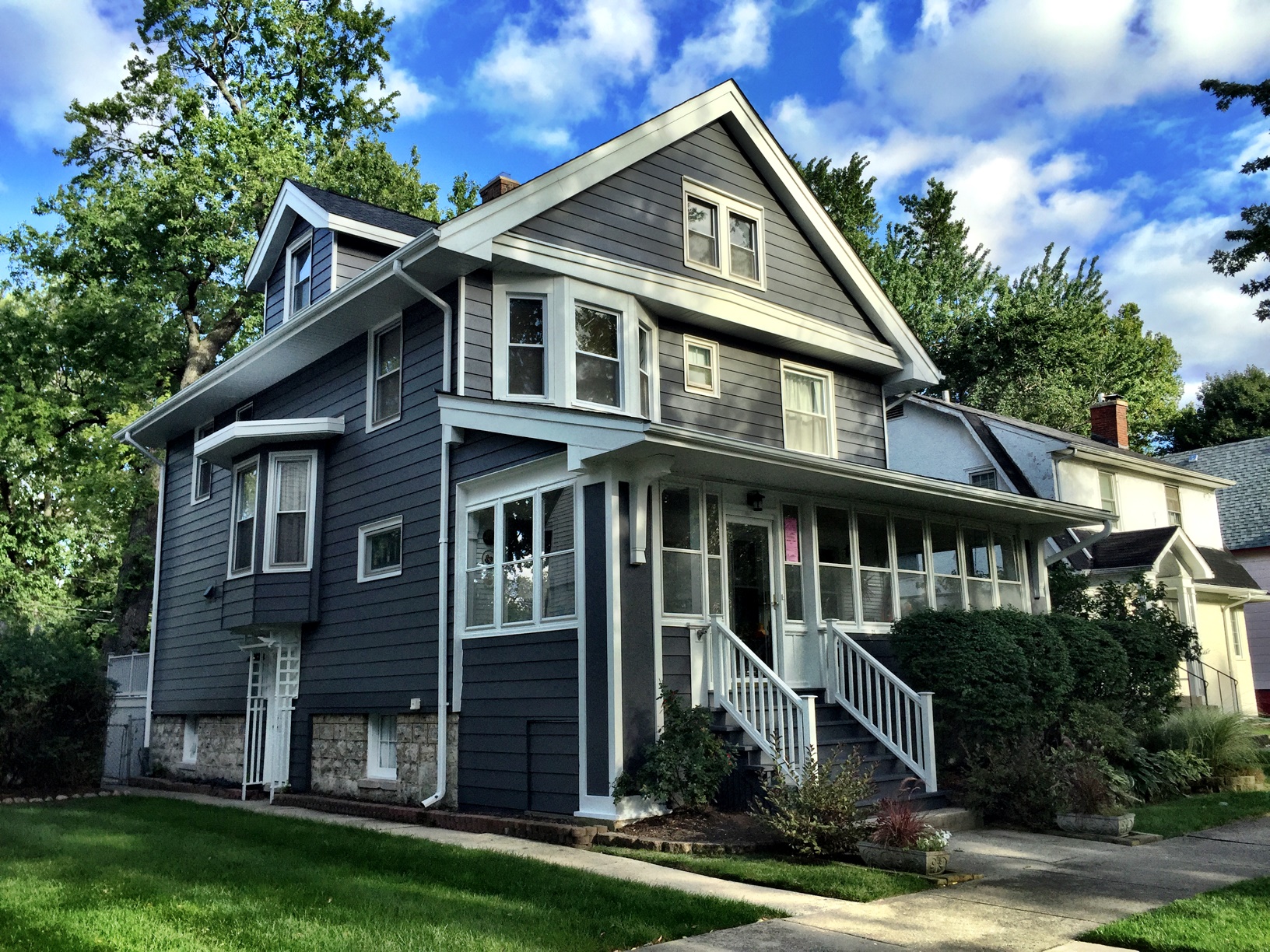
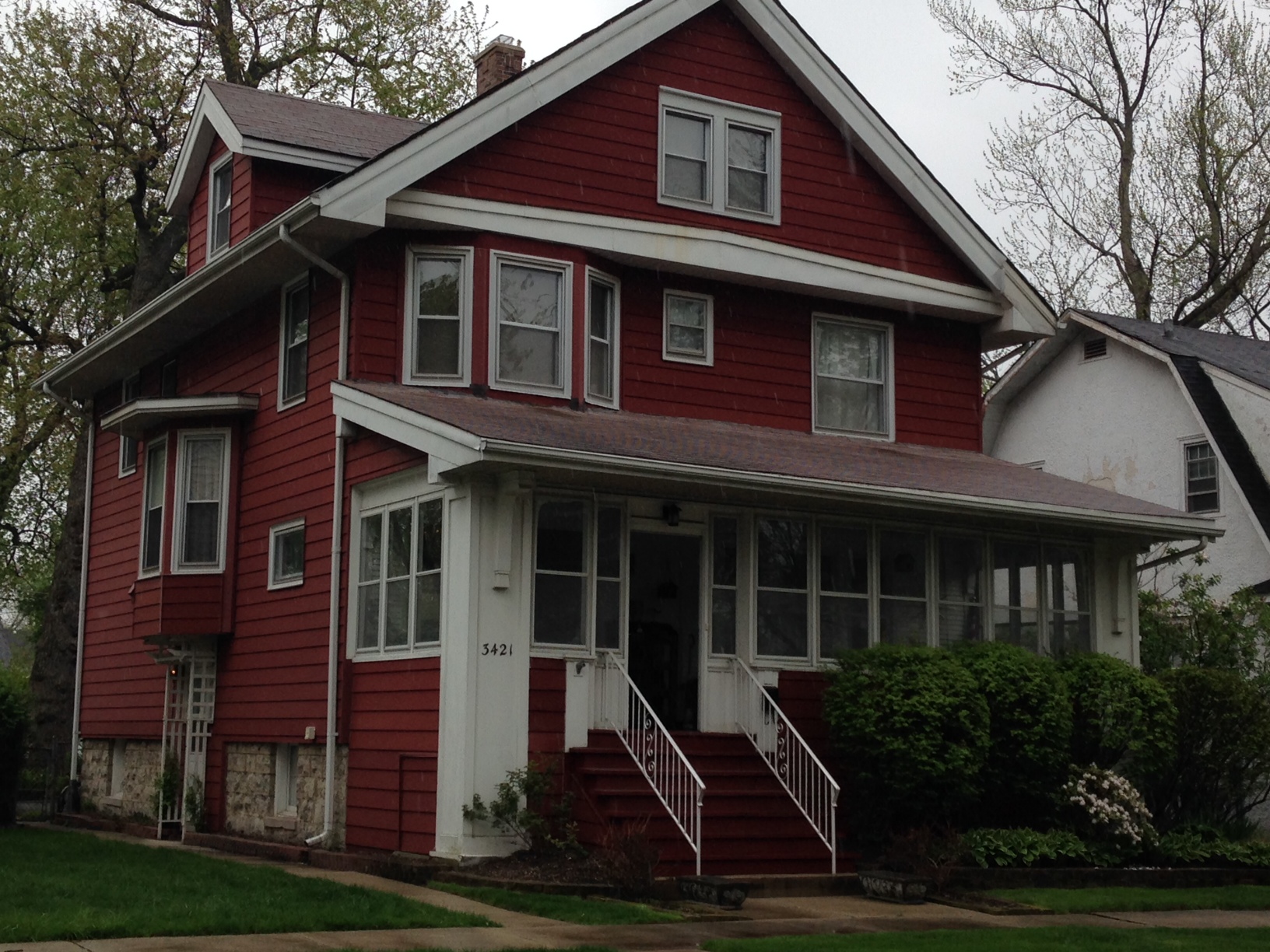
Dressing up your house with color can be a challenging task. Over our twenty nine years as painting contractors and color consultants, we have discovered a few tools and ideas that can help people make good color choices and end up with a pleasing result.

1- Ascertaining Personal Style
Zeroing in on your style is important because it influences your choices. Looking through magazines for pictures you like (or dislikes), gathering color swatches etc. can help you give some definition to your style.

2- Inventory of your House
A- Taking the Temperature of every room from 1 to 10 in terms of what works and does not work for you. As an example, if a green room is an “8”, perhaps changing the color to a more yellow/green will do the trick. If a green room is a “2”, you need to change the color.
B- Now take an Emotional Inventory:Function (what is room used for)
Who uses the room
Placement of furniture (decide before painting)
Change (is anything going to change?)

3- Re-assess your Pictures
Separate wishes and fantasy from what is more realistic. What do you really like about your room and what would like to see? What is in that picture you really liked? Was it the high contrast between the trim and the wall color or was it the color on the ceiling?

4- Look at a Fan Deck – Distinctions about Color
A- Cool Colors: Have a component of Blue: Blues, violets, purple, blue-green
B- Warm Colors: Have a component of Yellow or Red: Yellow-Green, Pink, Peach, Maroon, variations on Red and Reddish Whites
C- Neutrals: Can be cool or warm
Gray-Blues are coolGray-Browns (Taupe) are warm
Yellows in a color warm up the color, like tans and camel

5- Choose Color(s) – Decide on Tint
– Do you want just a “Hint” of the color
– Do you want “Contrast”, like dark walls and white trim
– Dark walls do not necessarily make a room look smaller. It can be the
opposite, like a brown room
– Want to create a more intimate feeling, paint the ceiling something else
than white.

Our experience shows us that color matters to people and that small variations can make a big difference. On occasion, color consultation gives an extra level of comfort in making those color decisions,

New Color Scheme for an American Four-Square House

New Color Scheme for "Period" House

New Color Scheme for “Period” House

Old Color Scheme for "Period" House

Old Color Scheme for “Period” House

The owner of this Period house in the near Western suburb of Chicago was looking to make a major change in the color scheme of her house. As painting and decorating contractors, we offer a Color and Concept Consultation service to help in successfully navigating the sometime choppy waters of color selection.

Early on, the client was toying with the idea of removing the aluminum siding – she later abandoned that idea. Instead, she had that siding repaired in a number of areas, had a new roof installed, built a new rear porch and new front railings, and indeed chose a new color scheme that harmonized with new roof color, which we had recommended.

Selecting interior or exterior paint colors can be quite intimidating and stressful to many people, especially when dealing with a “Period” house. In the consultation, we had recommended a dark red accent color for three small areas on the front of the house. It turned out that the client’s spouse did not like that idea, so we stayed with a two-color scheme.

Taking into account personal preferences is an important and necessary aspect of the color selection process, because people react differently to color. Making those color adjustments is an integral part of the consultation service we offer. For both colors, we selected a Benjamin Moore’s MoorGuard as paint, which has a very low gloss level. The client commented: “When the sun goes down, my house glows!” She was very excited to tell me this.

Professional Help with Color Selection Gives Peace of Mind!

As painting contractors in the Chicago area, we offer color design consultation to our clients. Today, we had a vivid experience of the true value of this service for our clients. At 8:15 this morning I get a frantic call from someone who had just found us on the web. Bonnie said: “ I have a paint color problem. There are three painters who just started painting my house and one of the colors does not work for me and I do not know what to do.” Having agreed on a fee of $75 for a thirty-minute consultation, I was ringing her doorbell at 8:55.

Color Fan Decks Are Intimidating

It turns out that both her and her husband are quite sensitive and attuned to color. However, both of them get shell-shocked when looking at a fan deck. Bonnie was happy with the siding color they had selected. The trim color was the one at issue, which is where we focused our attention. I then brought up the idea of painting the front door a third color. They both liked the idea.

After we selected a door color they both liked, Bonnie’s husband voiced the concern: “what will we do if the door color turns out a little too dark?” First of all, I recommend that they ask the painter to do some samples of the three colors on the actual surfaces. Additionally, I recommended that the painter gets a quart of the door color and a quart of a medium base of the same paint, so that he can lighten the door color if need be. The client felt very comfortable with my suggestions.

At the conclusion of the color consultation, Bonnie hands me a check for $100 and tells me: “ I added a bit more to the check because you gave me Peace of Mind today.” Those were golden words for me, since it is an integral part of the promise we make all our clients. She was absolutely delighted and so appreciative of the color advise she had received. I asked her to call on us any time she needs painting and decorating services in the future.

Color Consultation Meets Client’s Need for a Colorful Environment

Color design consultating is a sure way to reduce the stress (and the mistakes) of making paint color selections for a whole house at once. People who crave color are often intimidated and overwhelmed by having to choose paint colors and how to have them work harmoniously together.

As house painting contractors, we are often called o to offer color and concept consultation to clients in the Chicago area. We recently worked on a house where the walls were “builder-white” throughout. Having lived there for a few months, our clients were very much color-deprived. However, they were at a loss on how to go about it and put it all together. They took advantage of a two and a half hour paint color consultation. The first picture gives you a glimpse at the color palette selected for their project.

In order to produce a result, which is both expressive of the clients’ personality and nurturing to them, we have to really listen to them and see how they respond to color. We sometime have to modify our recommendations, based on who will be using the room the most and the particular needs of that person. So, paint color consultation is very personal service that greatly enhances the value of a paint job.

White no more as shown in our picture! More importantly, the result is both pleasing and nurturing to the clients.

Paint Color Selection


Result After Paint Color Consultation

How to Prepare for your Interior Paint Color Consultation

Color design consulting is a service Painting in Partnership, from the Chicago area, offers its clients in order to help relieve the stress of choosing paint colors for their house-painting project. Over the years, we have found that the results of such a paint color consultation can be greatly enhanced by asking our clients to do a little bit of homework ahead of the consultation. Let’s see what it entails.

First, we ask that you create a folder of pictures from magazines and the web, as well as color swatches. It is important that you select pictures and colors that you both like and dislike. Creating this folder will help you define your personal style.

Second, on a scale of 1 to 10, “take the temperature” of each room in your house, in terms of what works or does not work for you, 10 being a room that totally works.

The third step consists of taking an “Emotional Inventory”: how do you feel in each room? In coming up with your assessment, consider the following four factors:
– Function: What is the room used for? Does it serve its function well?
– Who uses the room: Are there special needs at play?
– Mood: What feeling, emotion or mood do you want to convey in the room?
– Change: Is anything going to change? Answering that question now will help you choose colors more appropriately.

As a final step, we ask that you reassess the pictures in your folder using the information you have now gathered on your space. What is it that you like the most in those pictures?

Client's Paint Color Experimentation

Client's Paint Color Experimentation

You are now ready to focus on colors! This is the part that many people struggle with, as shown in this picture. The color selection process can be an extremely stressful experience, but it does not have to be. On their own, many people will make very “safe” and conservative color choices, for fear of “making a mistake”. This is where a professional color design consultation can be most helpful.

At Painting in Partnership, we have found that doing the homework described above really helps clients in making color decisions that really work for them. Helping you create an environment that is nurturing to you is the result we strive to achieve with every client.