The painters were top notch. They worked very efficiently, courteously and extremely cleanly.
- Jack Bernauer, Inverness
Phone: (847)934-8885 | Email: info@paintpartner.com Visit PIP's Facebook Page View Mario Guertin's LinkedIn Profile Visit PaintPartner's Google+ Page Follow PaintPartner on Twitter Visit PIP's Pinterest Page Visit PIP's Houzz Page Subscribe to PaintPartner's RSS Feed

Author Archive for Mario – Page 3

A Young House, Made to Look Old, Is Being Remodeled

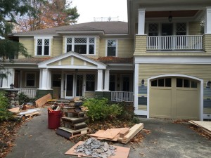
Cottage Facade

Cottage Facade

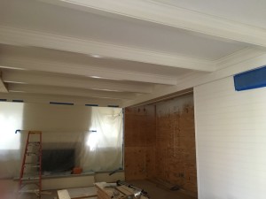
Cottage Woodwork

Cottage Woodwork

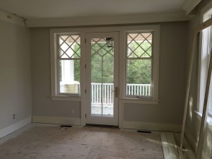
Cottage Window and Door Detail

Cottage Window and Door Detail

In a week, we will be starting the interior painting for this entire six- thousand-square-foot house on the shores of Lake Michigan. Even though the house is only thirteen years old, it was built to look old, from its architecture to the hand-brushed oil paint used on the extensive and detailed woodwork on the walls, trim, windows, doors and cabinetry.

Even though the interior surfaces were still in mint condition, the arrival of grandchildren in the family precipitated the need to remodel the house to accommodate the needs of the children (and some needs of the grandparents also). Very few areas in the house will be left unaffected by the remodeling, thereby causing the repainting of all the interior surfaces of the house. Below is a list of the major challenges we will face on this special project.

1- Volume of Woodwork Challenge:
The walls on the first floor and basement are almost all clad horizontally with four-inch beadboard. I guesstimate that there is at least mile of that beadboard and more is being added on the second floor. So one of the woodwork challenges is just the sheer volume of painting involved. Everything is to be hand-brushed from the beadboard, trim, built-ins, doors and windows.

2- Hybrid Paint to Be Used Over the Old Oil:
Because of the great amount of woodwork involved and the fact it is painted in oil, we were faced with the decision of choosing a new finish coat that would stick well to the old oil without requiring a primer coat on everything.

3- Matching the Finish on New Doug Fir Beadboard on the Hallway Ceilings in the Basement.
New beadboard needs to be added on some areas on the ceilings. Our challenge will be to match the umbered look of the old Doug Fir, as well as the old sheen. This one is still on the drawing board!

4- Painting the Kitchen Cabinets
The cabinets are currently stained, glazed and varnished. We will have to apply a paint finish on all the cabinet surfaces. That is a piece of work in itself.

Meeting the challenges of a project, developing the procedures necessary to achieve the desired result and doing additional training and practice where necessary are the ingredients to the success our team of craftsmen pursues on every job.

Dressing Up a Historic Chicago Row House in Mid-Century Colors

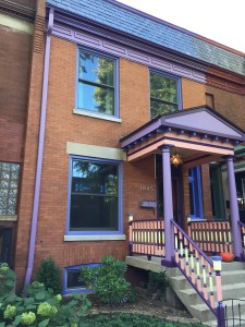
Historic Chicago Row House - After Painting

Historic Chicago Row House – After Painting

Historic Chicago Row House - Before

Historic Chicago Row House – Before Painting

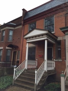
Our Painting and decorating company recently put the finishing touches to the façade of an historic row house in Chicago. The façade had a metal cornice and crown, five windows, a front entrance and a porch. As you can see from the Before picture, the façade was very subdued. The client felt that the façade did not do justice to the character of the house nor the beloved Mid-Century style of his interior décor.

With the client’s involvement, we developed a 5-color palette that introduced the Mid-Century style of the interior decorating of the house. The client’s passion for this particular style is rooted in his childhood with his grandparents. When he inherited their furnishings and other belongings, it started him on a quest to recreate those childhood memories in his own house. He did such an outstanding job at it that Houzz recently published a most interesting video on the interior of his house and the story behind its decorating elements. Click on this link to view the video.

By accident, it just so happened that the colors selected for the project happen to closely match colors that can be found in the Pantone color pairings for the 2016 Color of the Year, shown on this link . When we do color consultation, listening to the client is key to insure a successful result, in this case a result that reflects his personality and décor preferences, as well as beautifies the façade of his house.

New Color Scheme for an American Four-Square House

New Color Scheme for "Period" House

New Color Scheme for “Period” House

Old Color Scheme for "Period" House

Old Color Scheme for “Period” House

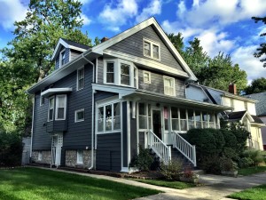
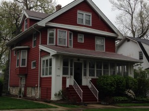
The owner of this Period house in the near Western suburb of Chicago was looking to make a major change in the color scheme of her house. As painting and decorating contractors, we offer a Color and Concept Consultation service to help in successfully navigating the sometime choppy waters of color selection.

Early on, the client was toying with the idea of removing the aluminum siding – she later abandoned that idea. Instead, she had that siding repaired in a number of areas, had a new roof installed, built a new rear porch and new front railings, and indeed chose a new color scheme that harmonized with new roof color, which we had recommended.

Selecting interior or exterior paint colors can be quite intimidating and stressful to many people, especially when dealing with a “Period” house. In the consultation, we had recommended a dark red accent color for three small areas on the front of the house. It turned out that the client’s spouse did not like that idea, so we stayed with a two-color scheme.

Taking into account personal preferences is an important and necessary aspect of the color selection process, because people react differently to color. Making those color adjustments is an integral part of the consultation service we offer. For both colors, we selected a Benjamin Moore’s MoorGuard as paint, which has a very low gloss level. The client commented: “When the sun goes down, my house glows!” She was very excited to tell me this.

Using Wallpaper to Create a Feature Wall

Wallpaper Feature Wall

Wallpaper Feature Wall

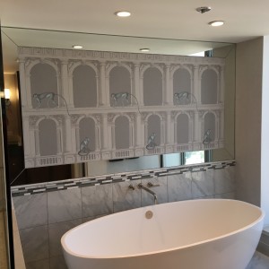
Our painting and decorating company recently completed a large wallpaper installation in the Gold Coast area of Chicago. Wallpaper can sometime be used in creative ways that bring excitement to a room. That project presented such an opportunity.

Part of the project included the creation of a feature wall above the tub area in the master bath. The interior designer on the project had the idea of using a classical wallpaper design with arches, monkeys and adding a custom mirror frame to create a fun and classy accent wall. The clients loved the idea.

The challenge for the installation consisted of coming up with the measurements for the wallpaper panels that created the most balanced effect, while maintaining equal measurements for the mirror frame all the way around the wall. After doing some brain twisting calculations, the magic formula was achieved! Then it was a matter of flawless wallpaper trimming and installation. Compared to the calculations, the installation was the easy part!

Using our skills as craftsmen, coupled with our commitment to produce a delightful result for all involved parties, guide everything we do as painting and decorating contractors in the Chicago area.

Tired of Frayed Wallpaper Edges on Outside Corners?

We are putting the finishing touches to an upscale residential wallpapering project on Chicago’s Gold Coast. Every wall of this two-bedroom condo was clad in eight different wallpapers, including three grasscloth and one sisal wallcovering.

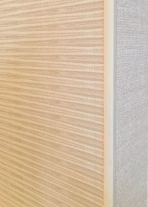
J-Channel After Installing Second Wallpaper

J-Channel After Installing Second Wallpaper

This project had an unusually high number of outside corners due to the fact the eight windows in the apartment were recessed into the wall by about a foot. Every window had about twenty five feet of outside corners each. In all, there were three hundred linear feet of outside edges in the condo: That is a lot of edges that can fray over time?

This is our clients’ retirement location – they are not looking to ever move again. They had the unit gutted and designed to their needs. We are just now completing all the decorating for them. Having understood their situation, we recommended the use of a J-Channel on all the outside edges. The wider edge (1/4″) of the channel allows for tucking the wallpaper under the lip of the channel. The thin edge of the channel creates a clean line for another wallcovering or a painted finish to but against it, as shown in the attached picture.

As painting and decorating contractors in the Chicago area, we first seek to understand where a client is coming form. We do not recommend a J- Channel on every installation. In fact it is rare we do. In this particular case, the J-Channel was the perfect solution to give the clients the look and durability they were looking for.