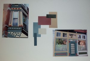
When developing a new historical paint color scheme for a building, we believe in involving the clients in the process. As indicated in a recent blog post, we recently went through the development of a new color palette for the façade of this unique 1889 Chicago brick Victorian-era building, now converted to condominiums.
As a first step, we invited the owners to attend a meeting with Rita Guertin, our Color and Concept Consultant. From the outset, it was evident that they all shared a common discontent about the current color scheme. During the meeting, the owners voiced their color likes and dislikes. Some even brought color samples and pictures. We believe that involving the clients early in this way helps to create a successful outcome for everyone.
Armed with that feedback and input, we began to put together a six-color palette for the building’s façade. One of the flaws of the old color scheme was that it did not take into account the colors of the building’s masonry: gray limestone, strong red face brick and warm/earthy tones for the common brick of the sides of the building. We felt that incorporating these colors into the palette was needed to create harmony, and highlight the beauty and character of the decorative features of the building.
We then organized a second client meeting to review our proposed historical color selection and its placement on the building. In order to easily communicate the concept, we overlaid our color selections onto four color pictures of the building’s main decorative elements. From the feedback we received, we made only one change to the color scheme: the warm buff color was replaced by a taupe gray color, which harmonized well with the mortar color of the common brick, as well as the limestone.
Our next blog post, will describe how you “rig up” to handle a project of this size and nature, in order to meet the many requirements of City ordinances, as well as EPA and OSHA regulations.


 Follow
